Posters have long been celebrated for their ability to inject personality and vibrancy into living spaces. They are not merely paper and ink but a reflection of personal tastes, inspirations, and aesthetic desires.
When considering posters for interior design, the initial step involves selecting a theme that resonates. Whether it’s vintage movie posters, abstract art, or nature photography, the theme sets the tone for the room.
Color scheme plays a crucial role as well. A poster can either complement the existing palette of a room or serve as a striking contrast, creating a focal point that draws the eye. The intended atmosphere of the room—be it serene, energetic, or contemplative—also influences which posters to choose. A thoughtfully selected poster can transform a mundane space into a source of daily inspiration.
But have you ever considered how the right frame can elevate this impact even further?
Page Contents
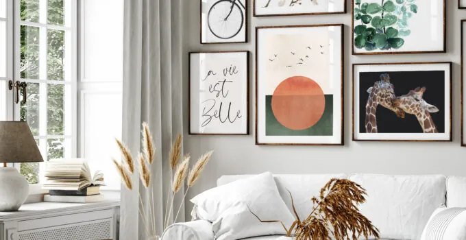
Mastering the Art of Frame Selection

Source: modulor.de
Choosing the perfect frame for a poster is an art in itself. It’s about more than just finding a border; it’s about enhancing the poster’s appeal without overshadowing its beauty. The size of the frame is the first consideration. Too large, and it can dwarf the poster; too small, and it fails to give it the prominence it deserves.
Color Coordination and Room Ambiance
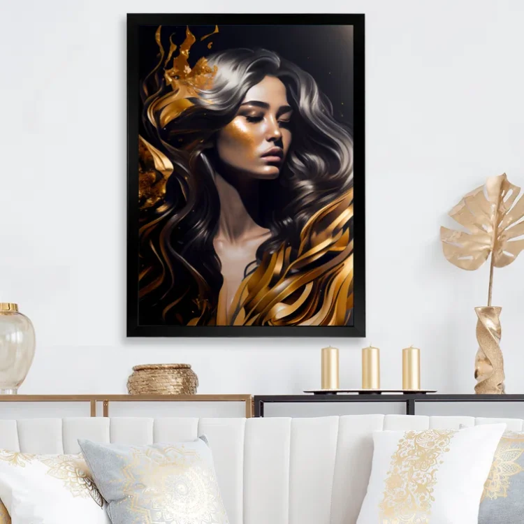
The interplay of colors between posters, frames, and the room itself can significantly affect the ambiance of a space. Choosing colors that harmonize can create a sense of calm and cohesion, while opting for contrasting colors can introduce dynamism and vibrancy.
The psychological effects of color are well-documented, with certain hues evoking specific emotions. Understanding this can be powerful in shaping the mood of a room through the strategic use of posters and frames.
The Impact of Lighting on Displayed Art
Lighting can make or break the visual impact of a framed poster. The right lighting can accentuate the colors and details of the poster, making it a true centerpiece. Conversely, poor lighting can render the most vibrant of artworks dull and uninspiring.
Natural light is often the best complement to artwork, but when this isn’t available, choosing the correct type of artificial lighting is crucial. Avoid harsh, direct light, which can create glare and fade colors over time. Instead, opt for softer, indirect lighting that flatters the artwork and creates a warm, inviting atmosphere.
Framing the Future ─ The Lasting Impression of Well-chosen Art
Source: old.gips-guwahati.ac.in
The art of selecting posters and frames for interior design is a testament to the power of visual elements in shaping our living environments. A well-chosen poster, paired with the perfect frame, can significantly influence a room’s ambiance, making it a reflection of personal style and aesthetic preferences.
The process involves a series of thoughtful decisions—from theme and color scheme to frame selection and lighting. Each choice contributes to the overall effect, turning a simple piece of art into a transformative element within a space.
As we consider the future of interior design, the thoughtful integration of art and framing will undoubtedly continue to play a pivotal role. It’s a reminder of the personal touches that make our living spaces not just houses but homes filled with character, inspiration, and beauty.
The next time you look at a poster or a frame, think about the potential it has to redefine a space. What impact will your choices have on the ambiance and character of your home?


